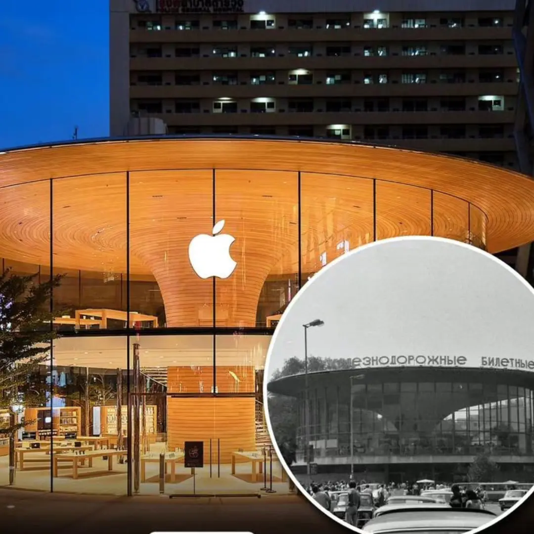
Apple, a name synonymous with cutting-edge technology and innovative design, has an architectural style that often surprises many with its roots in the 1960s Soviet Union. Drawing inspiration from the minimalist and futuristic aesthetics of that era, Apple has masterfully blended sleek, geometric forms with innovative, functional spaces, resulting in modern and visionary environments that captivate the imagination.
The 1960s Soviet Union was a period marked by bold architectural experiments and a forward-thinking approach to design. This era produced structures that were both minimalistic and futuristic, characterized by clean lines, geometric shapes, and a sense of grand, utilitarian purpose. These designs were not just about aesthetics; they were deeply intertwined with functionality, aiming to create spaces that were as practical as they were visually striking.
Apple’s architectural ethos echoes this Soviet inspiration. When you walk into an Apple Store or their corporate campuses, you are immediately struck by the simplicity and elegance of the design. The spaces are open and airy, with an emphasis on natural light and seamless integration of technology. This is not coincidental but a deliberate nod to the Soviet minimalist aesthetic, which prized functionality and clarity above all.
One of the most prominent examples of this influence is Apple Park, the company’s headquarters in Cupertino, California. Designed by Foster + Partners, the circular building, often referred to as the “Spaceship,” embodies the sleek, geometric forms reminiscent of Soviet architecture. The extensive use of glass, the seamless flow of spaces, and the integration of nature within the building’s design all speak to a futuristic vision grounded in minimalist principles.
Apple’s retail stores worldwide also reflect this architectural philosophy. These stores are not just places to buy products; they are designed as community hubs where people can interact with technology in a welcoming, open environment. The use of clean lines, neutral color palettes, and natural materials creates a sense of calm and focus, drawing customers into a space where the products and the user experience take center stage.
This architectural strategy is not just about aesthetics; it is deeply functional. The minimalist approach reduces distractions, allowing users to engage more fully with the products and services on offer. This mirrors the Soviet ideal of creating environments that serve a clear, utilitarian purpose while also inspiring awe and admiration.
Moreover, Apple’s use of space is profoundly innovative. Their designs incorporate cutting-edge technology seamlessly into the architecture, creating environments where the boundaries between physical space and digital interaction blur. This approach fosters a sense of continuous discovery and engagement, much like the visionary Soviet projects that aimed to push the boundaries of what was possible in architecture and design.
In conclusion, Apple’s architectural designs, inspired by the minimalist and futuristic aesthetics of the 1960s Soviet Union, create spaces that are both functional and visionary. By blending sleek, geometric forms with innovative use of space, Apple has managed to craft environments that not only showcase their products but also embody a forward-thinking philosophy of design. This unique fusion of past and present, functionality and beauty, ensures that Apple’s spaces remain at the forefront of architectural innovation, much like their products in the tech world.


